Helping Amicus turn volunteers into callers.
Amicus deployed Califa in 2012, after Y Combinator. For two years, Califa worked across its product, flows and styles, starting with the call tool volunteers used every day.

- deployed across product, flows and styles
- 2 yrs
- people at Amicus when Califa deployed
- 4
- to rebuild the call page after a year on hold
- 2 wks
Amicus helped non-profits turn their volunteers into fundraisers and advocates. Its outreach tools used the Facebook graph: instead of calling strangers, volunteers called their friends, friends of friends and neighbors, which made outreach much more effective. Amicus worked with organizations such as the HRC, AFL-CIO, DCCC and Moms Demand Action, and was part of campaigns to stop anti-LGBT legislation.
The first version of Amicus was built by developers and didn’t take into account how volunteers would actually use it. The call tool, the app’s main point of interaction, showed each volunteer a list of friends to call. Volunteers had to decide who to call, click their name, and then click the call button. The choice drew their focus away from the person they were calling and the script they were reading, and the friction stretched the time between calls. For a tool sold to large non-profits on the number of successful calls, that mattered.
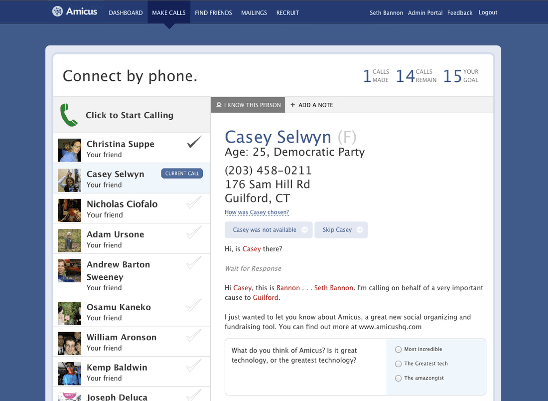
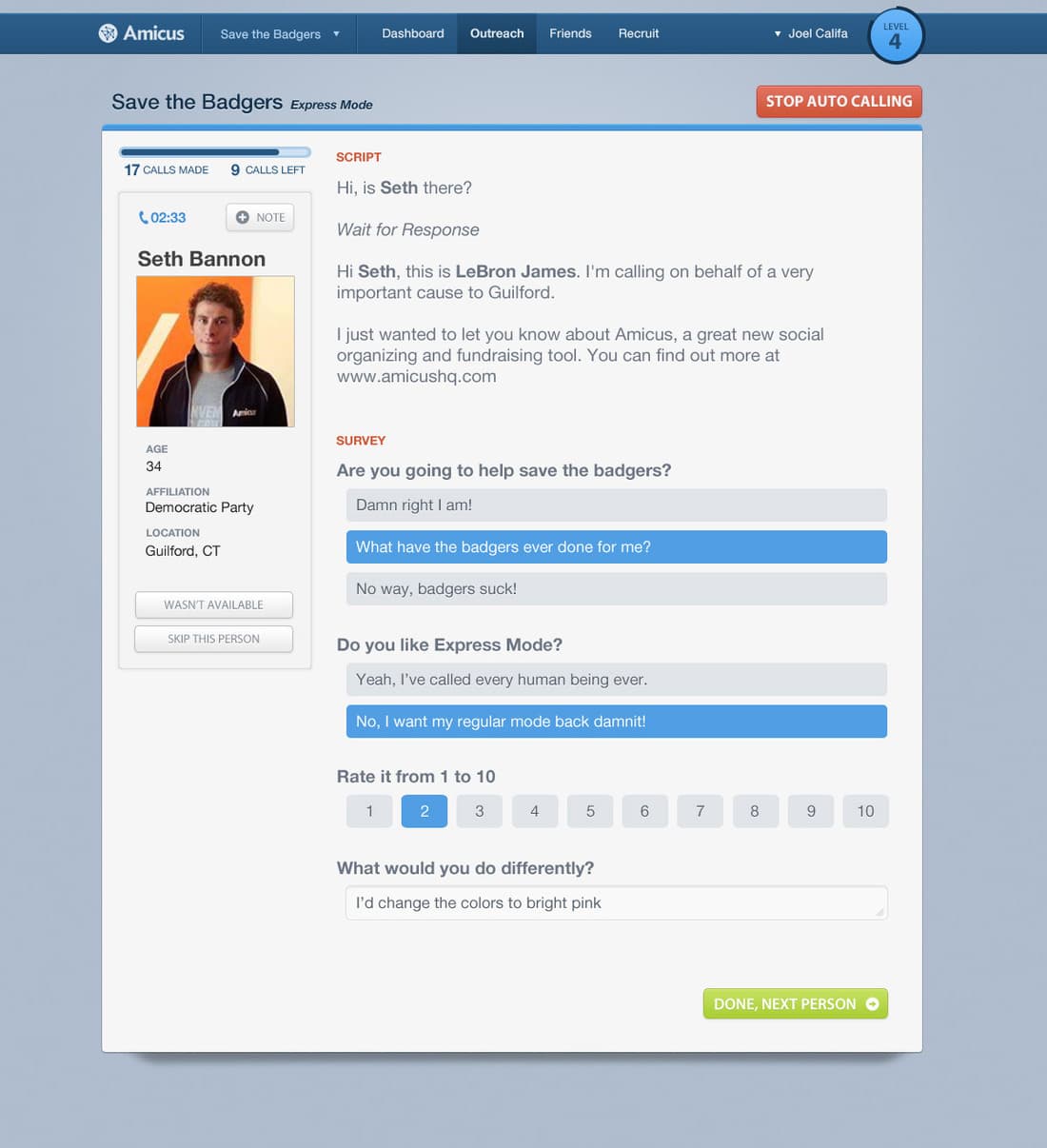
Califa proposed an “express” call tool. It removed everything tangential to the call, let the app pick who to call next, and added auto-calling and a form for saving what volunteers learned, for the non-profit or the next caller. When a call ended, the volunteer submitted the form and the next call started, with an option to skip.
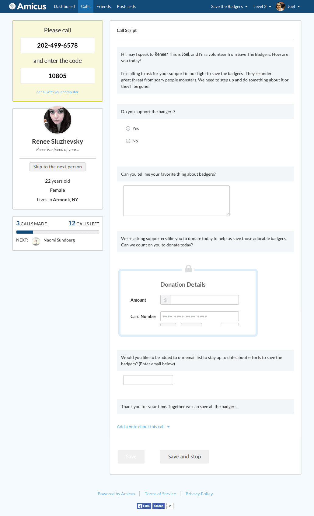
At the time, Amicus was four people on two desks at General Assembly, and the express tool was tabled for over a year. As Amicus grew into an office in SoHo with a larger team and an agile process, it came back. A sprint team rebuilt the flow in two weeks. Rather than design new mocks, Califa built the design on the sprint branch and pushed changes as it had them. It was deployed remotely at the time, and working in the branch kept the team in sync with the latest version of the design. It also coded animations that gave each part of the screen context, and designed a card for each state a call could be in, with the instructions for what to do next.
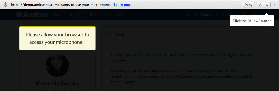
Volunteers could call through their phone or their computer’s microphone. Calling through the computer meant the browser asked for permission first, and users often ignored the prompt, which could block the app from asking again. Califa designed a dark overlay with a tooltip that flew across the screen to the prompt, with a version for each browser’s way of asking.
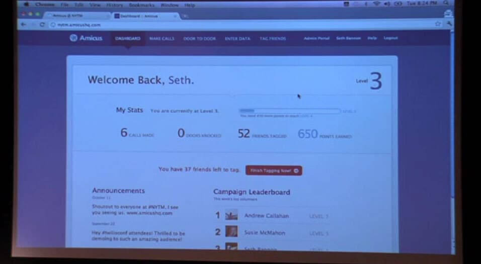
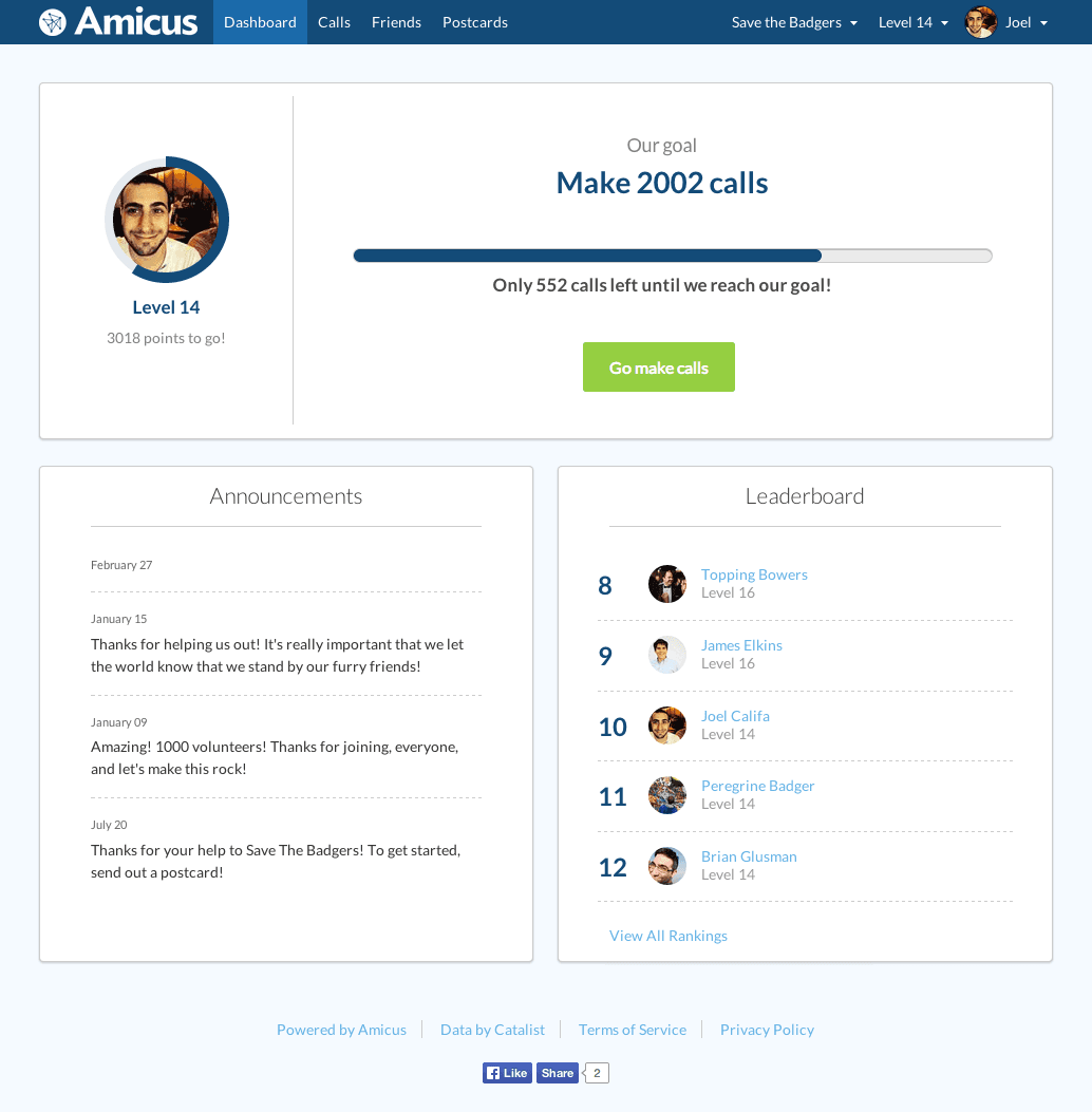
The dashboard had a lot of stats, the organization’s announcements and a leaderboard, but no clear next step. Califa cut it down to fewer stats and one call to action. Usability tests showed that two buttons, one to match friends with voter data and one to make calls, confused users (in hindsight, obviously), so the dashboard led with one: make calls. That version shipped. It showed volunteers how many calls they’d made and nudged them to make more, for the points.
Then Amicus changed how it motivated volunteers. They already cared about their causes, so a points system was the weaker motivator. The progress bar changed from the volunteer’s next level to the whole initiative’s goal. Levels stayed, but became secondary.
Califa also explored ways to bring the feeling of a volunteer office online: an Energy Room of active callers, temporary teams in the style of online games, and then fixed groups of friends with a group leaderboard. A design sprint with engineers produced “Why are we here?”, where volunteers wrote their reasons for joining a campaign as motivation for others.
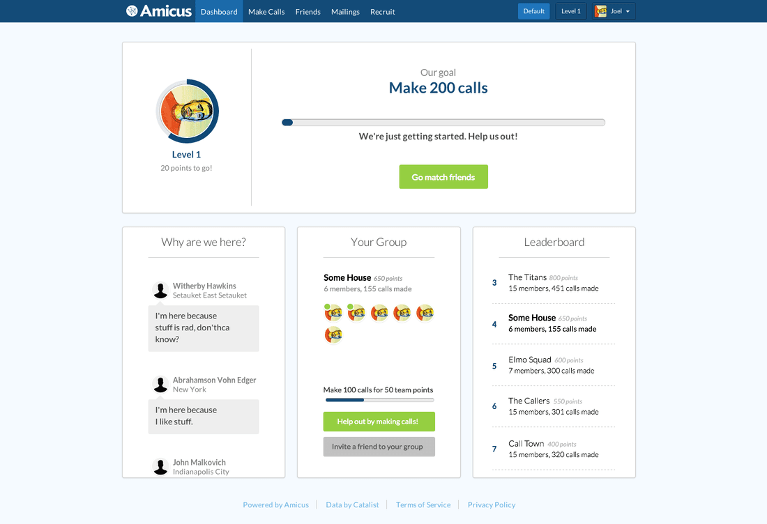
The new dashboard and fixed groups were well received by Amicus’s non-profits, and both had a positive effect on volunteer engagement.
Ready to deploy?
Rollout takes about a coffee. He shows up and starts working.